Saturday, December 31, 2016

New Idea For Christmas Presents


What did everyone do that was creative this Christmas season? I'm sure all the creative juices were flowing, I know mine were active. I decided to make name tags out of miniature canvases. I cannot take credit for the idea. I was looking through a Christmas sale art catalog and saw a picture of a mini-canvas with a name on it, so I decided that was what I was going to do for the gifts to my boss and co-workers.

I started out with simple, inexpensive miniature canvases from none other than Wal-Mart, of all places. Just a side note, I ordered mini-canvases from Dick Blick after Christmas to compare them, and I actually like Wal-Mart's better. However, I still need to experiment some more on Dick Blick's before making a final decision.

So, I used Dick Blick Artist Acrylic paints and a little of Liquitex Basics, but I definitely liked DB's acrylics better. They are thicker and I found I had more control with them and put fewer layers on the canvas because they also seemed to have better coverage. I also used Pigma Micron Archival Ink pens to write the names with and also for some other little decorations. I tried to make each canvas very specific to the individual, so I tried to use their favorite colors and different designs for each person. I wanted to take more photos of the canvases, but it took me quite awhile just to get four of them done, and it was getting close to Christmas, so I had to hurry to finish them in time. Needless to say, I only got a few photos of them before they were given as gifts.

Here is what they looked like. The backgrounds that the canvases are up against are actually the gift bags they got attached to:

This is April's. Her name got messy when I painted a thin layer of  acrylic gloss medium over it and the "waterproof" ink I used smudged. I had to fight like crazy for fix it before the medium dried on me, and I'm not entirely happy with the way it came out, but it could have been so much worse.


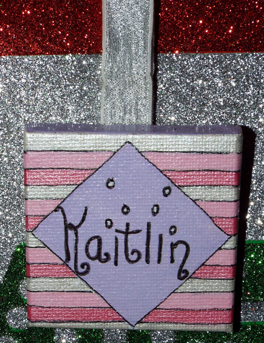
This one was for my boss, Kaitlin. She loves pink and glitter. I used a .05 pen for this name, the other canvases I used a .03 pen. I didn't like how thick the letters were with the .05 pen, which is why I switched for the rest of the canvases.


This is Jordan's. It's a little unusual because the "r" in the middle of her name is capitalized while the surrounding letters are lower case. The capital "R" allowed me to use a bit more creativity than the lower case one would have, so I just made an executive creative decision.


 And finally, this is Peggy's. The background for her name in the middle of the oval is actually pink, but it's hard to tell in this photo. 


For each of the canvases, I used a piece of elasticized material, each of a different color, and used my glue gun to glue them to the top of the canvas in a loop (I attached them to the back wood support). That allowed the canvas to be hung up and allowed me a way to attach the canvases to the bag the presents were in for each person.

It was fairly difficult to write on the canvases with the pens. I had a hard time drawing a straight line or getting a spot exact. The canvas was pretty smooth as far as canvas goes, but it was still not real easy to do. You can see the lines are crooked and wobbly. But I had a ball doing these and my co-workers and boss all seemed to like them very much!

So, what creative ideas did you guys come up with for the Christmas season???  I'd love to hear all about them.


HAPPY NEW YEAR EVERYONE!!!

Monday, September 26, 2016

New Path in Life - New Challenge


Beth (left) and myself (right) at a CPSA convention


I have been trying to decide whether or not to let people know what is going on in my life. I don't believe in completely opening up my entire life online, especially on Facebook and other assorted social media sites.  But, often God leads us down a path we did not expect. One that He knows will be very difficult, perhaps even painful, but the end result may be that we are able to help others who also are going down a similar path in their lives.

I don't know where God is going with this new path. I'm not sure how I can help other people, but if God wants me to help others He will provide a way. I do, however, know one thing: God has never let me down and I know He never will. There's a reason for everything that happens. I may not be able to see the light at the end of the tunnel, but I know it's there. And I know that with every step I take, God is walking with me, holding my hand all the way and leading me safely down this pitted and booby-trapped road. He will lead and guide me and I trust Him with every fiber of my being.

So where in the world am I going with this?  Well, here it is: Nine months ago I was diagnosed with MS, or Multiple Sclerosis. MS is an incurable disease of the central nervous system, but fortunately there are treatments that can help slow down the progression of the disease. So when I was given my treatment options, and yes I was allowed to choose my treatment plan, I chose the one that seems to have the best results in slowing down the progression of the disease with the fewest side effects. It means giving myself a subcutaneous shot three times a week for the rest of my life, unless, for some reason, the disease progresses to the point that I need to switch treatment plans. I'm hoping that won't happen.

Look Into My Eyes
After my diagnosis, I went to many bad places. I’ve had my crying spells and pity parties. I questioned God. "Why me?” I asked. “Haven't I been through enough in my life?" As though that's actually a valid question. We all have terrible times we go through in life but that doesn't mean we get an exemption from anything else bad happening to us. Then, I made a decision.

I may have MS, but I don't have to let it control my life. I still work at my full-time job at Monterey Mushrooms. I still do housecleaning and mow the lawn (though all of you who know me also know just how much I dislike housecleaning and try to avoid it like the plague). I still help people move furniture and I still try to exercise, though, to be honest that last part doesn't happen nearly enough (and to think, I used to be addicted to exercise!). I try not to think about whether or not I should do something based upon how my MS may affect me. I just do it. The only exception is the heat issue. Simply put, I melt in heat and humidity. Seriously. I melt. I think it's mostly because I spent half my life up north. I grew up not far below Canada. I LOVE cold weather, snow, and ice! Well, it seems that heat can exacerbate MS symptoms, so sometimes I do think about that if I have to do something out in the heat. Mostly, I just live my life and see what happens. Just like the Christie Lane song, "One day at a time, sweet Jesus." 

Tabby
The most common symptom of MS is fatigue and sometimes I have that in spades! Many of the medicines used to treat MS cause fatigue, which is a double whammy. The medicine I chose does not cause fatigue and that's one of the reasons why I chose it. I get tired enough just from the MS itself. Honestly, fatigue is my biggest battle right now. Well, I do also have a serious lack of focus and I can get distracted more than a teenage boy with ADHD. That all means I need to be more organized, take good notes, and jot things down on the calendar. Uh huh. I’m working on that calendar bit too.

I don’t know if you noticed it or not, but I haven’t even mentioned my art yet. Well, here it is: I am trying to do my art, but if I were honest with you I’d tell you that it’s not easy. Remember that lack of focus and getting distracted bit? Add to that the fact that I’m post-menopausal and you’ve got a whole new ball of wax to deal with. I’ve now got projects started in clay, watercolors, acrylics, colored pencils, and three in graphite, plus a statue I am working on. I get started on one, then pause for a day on it and get started on another project, and then another, and………well, you can see where this is going. I don’t get a whole lot done, but really I’m trying. If I could just stop getting distracted………… wait, what was I saying?

Now that all of that news is out in the open, onto other news. I do have a new camera, thanks to my wonderful husband, so I can take some more photos to post here. I do intend to get more artwork done, that is actually completed. I’m hoping I finish them before my mind wanders away and can’t find its way back. I have a LOT of plans, and I may even get some done before too long.

So keep me in your prayers, but don’t overly worry about me….and if you happen to find some extra energy just hanging around looking for something to do, please send it my way.


Pinky & Rosie


Morning Devotions

Saturday, September 10, 2016

A Slight Detour

Normally, you all know me for creating artwork in colored pencils, pastels, and graphite. Recently, I decided to try something new. Clay. Polymer clay to be exact. So I've been working with the clay and armatures, trying to figure it out for myself with the help of a couple of websites and one book in particular called "Fantasy Creatures in Clay: Techniques for Sculpting Griffins, Dragons, and More" by Emily Coleman.  It's a great book, and very informative.

I had also been working on "Trail of Painted Ponies" statues. I decided to see if I could combine both of them. I found some black clay with gold glitter in it and thought it would look interesting as a horse. I had not gotten the results I wanted by painting the horse statues, so I thought maybe I could literally drape the resin statue with a very thin sheet of that black gold glitter clay. So I did it.  Not real keen on the results, but I know how I would do it differently if I did it again. I also went crazy making all different bases for it and other statues I'll be working on. Now, I have made the armatures for the wings for the horse, and I've begun putting the clay on. I have most of the clay on one wing, but no details and haven't finished shaping each feather yet. It will look much better when I finish all of that, but for now, this is the point I am at.

I have posted some unedited photos for you to see. Some of the photos were taken with my cell phone, some with my camera, but none of them have been edited at all.

The resin horse statue is layered with Fimo Effects Polymer Clay. The color is called "Twinkle, Twinkle." The base is also made of Fimo Effects clay, this one is called "Opal." It is a very hard color to work with because whatever they use for the glitter and sparkly stuff is very chunky and hard to roll out and keep it from falling apart. It may also be old clay and it's just quite dry. The base, as you can see, is just very simple.

"Stardust"

The armature for the wings was made with 16 and 20 gauge armature wire and aluminum mesh with a little tinfoil. I didn't get a photo of the armature after it was completed. I used a glue gun to add some wire to the mesh which would give the longer feathers some stability. 


 These last two photos show the clay being added to the wings. In these pictures I have the wings looking a little mussy, you know, not orderly and straight. More like they are being windblown, which they are because they are going to be placed on a cantering horse. But, I'm not sure I want to keep it this way. Plenty of time to decide before I bake them.

There are no details yet and still a lot of shaping to do as well to each feather, so they are not even close to being completed. I took the photos from two different angles.


The clay I used for the wings was "Twinkle, Twinkle" and " "Glitter White." I blended them together in odd ways to make it look more interesting and to go with the "Stardust" name. I also added several different colors of glitter to the clay before blending the two colors together, which is why you can see some odd colors and glitter in the feathers.

Well, that's where I'm at right now. I might be able to finish this wing within the next week, so I can get started on the second wing.

This whole thing, the horse, the base, and the wings are all loaded with sparkly, glittery stuff. I think I over did it a bit much.


One more photo for you. This is another base I made for another statue. As you can see, this is a two-tiered granite base. It was made with Fimo Effects clay. The color was called "Gray Granite" (surprise, surprise).

 
                                                       Two-Tiered Granite Base


So, there you are. This is what I have been working on lately.

I apologize for not posting regular blog articles for quite awhile now, but I'm trying to get back into the swing of it. I will try very hard to do better for now on.

Thank you for reading this article. I hope you enjoyed it.

~ Happy Arting! 


Sunday, April 17, 2016

Paper Review: Shizen Design Pastel Paper


Pkg of 25


Typically when I buy paper, I use it for multiple purposes. Here's the results of my attempts to use this Shizen pastel paper:

First, for pastels, this paper does not work for hard or semi-hard pastels at all! They scrap off the top surface of the paper. Furthermore, if you try to blend harder pastels, it also tears up the paper. I then used some buttery soft pastels and that was okay, but again, I couldn't blend the way I like to, which is with my finger. In addition, the paper does not hold very many layers of pastels at all and you cannot spread the pastel around the paper at all.

Secondly, I love to use pastel paper with my soft, buttery colored pencils. This paper does not handle pencils at all. You cannot blend on the paper well, it tears it up. The pencils, yes, even the soft, buttery ones, literally scrap off the top coat of paper.

Then I went onto Inktense and Neocolor II just to see what would happen. This paper did not handle water well at all!! After getting the colors wet, the colors would not spread and blend like on every other kind of paper I've ever used them on and the paper literally buckled. So, nothing with water should be used on this paper.

Finally, I got out my pastel powders, the equivalent to pan pastels. They worked nicely enough, but again, using anything else on the paper, like your finger or a blender, messes up the paper, and it does not take but a couple of layers of pastel before the tooth of the paper is all filled up.

In my opinion, this paper is not worth the money. I like my paper to be multi-purpose, and I've always used colored pencils on pastel paper because I love the texture. The only thing I'd remotely think of using on this paper is maybe super soft pastels and pan pastels, but even those have limited use on this paper. Blending and multiple layers of pastels are nearly impossible. For paper that is so thick, it sure is very fragile and not very useful.

I am sad because I was looking forward to playing with yet another brand of paper. I heard that this company also makes watercolor paper. MAYBE I'll try that, but not sure I want to throw away any more money on this company. I have heard that they make professional watercolor paper. Still not sure I want to put out the money and try it after this mess. Sorry, but I did try. The only recourse I have left to try to make this paper useful is to try acrylics on it. Haven't gotten there yet, but I will soon enough.


Note: Sorry for not having any photo examples of my experiments on this paper. My camera was still  missing at the time and I had not yet gotten my new camera.  I will take photos when I try acrylics on it.


Saturday, March 26, 2016

Update on Studio Set-up: Cubbie units for storing art magazines

Now that I have a new camera to take photos with, I can give you an update on the cubbie units for all my art magazines. I keep all my art magazines so I have literally years of magazines and I had no way of storing them. I had a wonderful friend, Helma, make me this cubbie and she did an incredible job. It's perfect! Now, all my magazines are organized by name and year, and they're easy to grab for information anytime.


Ignore the bookshelf to the left that is overloaded with art books. Yeah, I can't fit all my art book in there, so I have some stacked in front. That's another project.  And don't look at the three drawer storage unit to the right. Yet another project. One step at a time. Lol!


Saturday, March 19, 2016

Review: Richeson Toned Gessoed Hardboard Panels - Part I

Recently I ordered several of the brand new Richeson toned gessoed hardboard panels that just hit the art stores, and yesterday they arrived. I spent last night playing around to see what these panels were really like.


Here is what the panels look like. They come in two colors: Mid Tone Gray and Umber Wash.  I ordered two 6" x 12", one of each color, and one 8" x 10" umber wash.  Dick Blick is having a special deal since these are a brand new item. You buy one size and color, say a 6" x 12" umber wash, and they give you a 6" x 12" mid tone gray for free! So I ordered three panels and I received six. Love that deal.


Note: Since my camera is still lost, I had to take these photos with my phone, and they are not very good. Unfortunately my phone does not read colors very well. I apologize for the quality.


First Impressions: 
After I got the plastic off the panel I ran my hand over it and was surprised at how amazingly smooth it felt. Remember it is a gessoed board. I expected more tooth than this.


The edges of the board are beveled, which is nice and it will fit into a frame quite nicely. It reminds me a lot of Ampersand's Hardbord, except for the beveled edges and the toned top.  Here is a close-up of the beveled edges.


Colored Pencils: 
Of course, the first medium I chose to try out on the panels was my favorite - colored pencils. I love to use my pencils on boards and panels of all types, so I was excited about trying this new board out!

I chose to just draw a simple circle. After 3-4 layers, I was just pushing color around and the tooth had completely disappeared.  Here it as, without being blended with a brush yet. I could also add light colors on top of darker colors without a problem.


So, after I blended with a bristle brush with a medium pressure. I did use hard pressure at times because the colors simply would not blend well together. As you can see below, a lot of the pigment came off rather than blending.


But there is one thing I have discovered. You can erase every last shred of colored pencil completely off the board! No sign that it was ever there. Also, if you like to use turpenoid to blend your colors, all it will do is take the pigment off the board rather than blend.


So, my conclusion for this part of the review, is that colored pencils do not work well on these boards, sadly. I was so looking forward to doing some CP paintings on these.

For the next review, I will try water color and watercolor pencils on these boards and see how they work. Then I will try acrylics and finally oils.

I hope you enjoyed this review and found it informative! Keep an eye out for the next one coming soon!

Happy Arting!